December 30, 2008

Put that in your Papirmasse and schmoke it.


Production for issue 2 of Papirmasse is underway!  What's that you say?  You're a bad blogger and haven't even told us what this paper-thingamajigger is in the first place?  True.  But since a trip to San Francisco and many deadlines loom in my near-future, I'm going to have to delay any explanations until January.  In the meantime, here's a preview of the cover image of issue 2, and a link to the official website, where all is revealed.

December 23, 2008

Published

And it looks great!  Vue went one step further and turned the illustration into a nifty punk-rock Christmas present in the form of a two-page spread documenting all the bands the members of Les Tabernacles have been in (hint: approximately a million, by the looks of all those squiggly lines.)  Click here for a link to the hi-res version.


December 19, 2008

First Colour Illustration


I've done illustrations before, but they've always been for 'zines or activist groups with low budgets, so I've never had the pleasure of working in colour, nor have I had the pleasure of *ahem* payment. Hence the excitement over landing the cover of Vue Weekly and getting to illustrate one of Edmonton's most well-known rock bands, Les Tabernacles. Some might say it's small potatoes, but everyone has to start somewhere, and I'm pretty stoked with how everything turned out. In fact, I had such a great time illustrating this that it's making me wonder if painting is really the path I should be pursuing.
As far as illustration goes, though: do I ever feel like I have a lot to learn! It was difficult choosing a particular style to go with. In the end I chose the strategy of following my heart; for example, since the project called for 6 portraits to be drawn from fairly low-quality photos, I had this great idea to draw the guys heads coming out of one of those whack-a-mole games. I still think it would have made a killer illustration, especially with an ominous shadow towering over them, but I realized that I would die of boredom if I had to draw every last detail of a whack-a-mole machine.

I ended up going with a pretty abstract arrangement, and am really happy with what Vikki (graphic artiste extraordinaire) put together for the inside spread:
Below are some work-in-progress shots, with colour choices being made. Choices!!


December 9, 2008

My New Favourite Website

My Love For You is a Stampede of Horses.  

More inspiring than even the best issues of Juxtapoz.  Seriously, it's like eye candy and brain candy at the same time.  Where do they find these artists?    

December 5, 2008

Threadless (ie. ka-ching, or, $$$)


I have gone in search of mountains of cash and submitted a design to Threadless. If you think the above shirt is something that you could possibly someday envision yourself wearing, well then pretty please, head on over and cast your vote. They also might publish it as a print, so if you'd like to own it as a print, once again, please vote.

Amazing!


It seems I am not the only one who has spotted the similarities between Canada's Prime Minister, Stephen Harper, and a hamster. The keen eye of Don Martin in on the trail too. In a recent National Post article entitled "What we can learn from Stephen Harper and the Syrian hamster", Mr. Martin writes that:

"It took Prime Minister Stephen Harper more than two hours Thursday to arm-twist Gov. Gen. Michaelle Jean into terminating Parliament after just 16 days.

Speaking of just 16 days, that’s precisely the gestation period of the Syrian Hamster, a solitary creature that will not live with other hamsters past a certain age without fighting and must be kept in separate cages."

He goes on about hamsters for a while after that. Because SH is so hamstery that even right wing pundits can't let it go. In fact, I rechristen him Stephen Hamster.

Is it the beady little eyes? The similar gestation periods? The giant exercise wheel in his office? I don't know, but I do truly hope that Don Martin responds to the e-mail I sent him, and that we get off on a long exchange about all of our Prime Ministers hamstery ways.

(The best part of this e-mail is the ads that popped up on the side)Though I am a little inclined as of late to say that Mr. Harper may, in fact, be more like a weasel. Today he cancelled Canada's Parliament to avoid a vote that would have put a coalition of his opponents into place instead of himself. If you aren't Canadian, the analogy is that he pressed Pause, Reset, Play on the government. I'm not going to get into it here, but there are some decent articles out there on the issue, such as this one and this one. Strangely, neither mentions hamsters. Damn editors!
In closing, here is one of my favourites from my Stephen Harper photo collection (hey, everyone has to have a hobby), a collection that I started long before I ever even heard of the Framing Harper Portrait Contest. Some things are just written in the stars, you know?

November 12, 2008

ENOUGH OF THIS MADNESS!!

I finally have a website - a **real** one!  This blog will continue to exist as a place to bounce around my newly finished work and blab about projects, but for goodness sake: get thee to www.hellokirsten.com!  

Over and out.

November 6, 2008

I Don't Know What Came Over Me


I don't even like famous people.  I just suddenly had to illustrate Ben Stiller.  Maybe I was drawn to the ears.  I also think that this drawing somehow brought to the fore an as of yet unnoticed similarity between Ben Stiller and Tony Blair.  Hmmm.

October 28, 2008

Kim Jong da Bomb


I am hatching mad plans to turn this sucker into a super cheap print.  You in?

October 27, 2008

From the vault: Oh Alberta!

All those wheat bales of hay give away your lusty ways. 
This is an old poster from the Lip 'zine 'Public' issue.  Everyone made a different 'page' of the 'zine and then we wheat pasted them up all over Montreal in a few glorious hours.  (It's a grain elevator can-can dancing, to those of you who didn't grow up on the Prairies.  Yes, they dance surprisingly well.)


On a side-note: why did no one warn me that trying to design and create my own website would lead to frustration and possible insanity?  Not that I would have listened, but MAN, computers can be annoying to work with.  I miss painting...  :( 

October 10, 2008

Mural #2

So, a few years ago Alberta's short-sighted Conservative government gave each and every Alberta resident a tax-free cheque for $400. Nevermind that this $1.4 billion could have gone towards library cards (we're the only province that doesn't have free libraries), abolishing healthcare premiums (we're one of the only that has to pay them, though that's thankfully ending soon), hot lunch programs, mental health programs, affordable housing, etc., etc., etc. ... I used my money to pay for a moving van and got the hell out of Alberta.

But then two years later I found myself back here again. This time around the plan is to make some money and run back to Montreal, where I will use my cushion of cash to pay for a studio for a few years. That being said, I haven't posted a ton lately because I am almost literally working ALL THE TIME. Okay, I sleep. But when I'm awake, I'm at a job. Really.

Luckily one of my jobs is a sweet mural-painting gig. Earlier this week we installed our second mural of the summer (and last for a while; it's cold here now! Brrrr). Here are a few shots of the mural's progress over the last few weeks (courtesy of head mural honcho, Ian Mulder).

First, we find a wall. This one is on a metal shop in Edmonton, next to Barb and Ernie's.

Then, we paint paint paint the whole thing in studio. It's big!
Next, we paint the wall and spend tons of time raising the lift, lowering the lift, climbing up and down the ladder, accidentally dropping things off the lift and running down as fast as we can before they blow into traffic... Oh yes, we also attach the mural to the wall.
We do a lot of touch-ups on the wall, changing colours, repainting things. And finally, after three cold and windy days, it's done! The wall is ugly no longer.

September 14, 2008

Anarchist Bookfair Poster


The poster for the 2008 Edmonton Anarchist Bookfair is done and printed! I've done B&W posters before, but never for something with the budget to print in *gasp!* colour. I have to say that I am super pleased with the result; for some reason I was pretty nervous about how it would turn out, but when I saw them last night in the trunk of Jeff's car, in a parking lot at 2 a.m., well, I was so excited I did a little dance.

Of course I highly recommend that if you're in Edmonton the weekend of October 3, you come to the fair. It's the largest anarchist bookfair in Western Canada, and there is always a ton of super inspiring, really cool DIY stuff: art, zines, posters, books. Anarchist bookfairs are pretty much seas of hidden treasures, full of cool stuff you will never find anywhere else.

2008 EAB
Ukrainian Centre
11018-97 st.
October 3: speaker @ 7
October 4: bookfair 11-7
October 5: bookfair 12-5, followed by a closing party for whoever wants to come.
Free vegan food, free childcare, free admission, lots of fun stuff to see and do.

edmontonanarchistbookfair.ca

September 13, 2008

Preview

Here's a preview of a fun project I'm working on: it's the ladies of SATC with moustaches!!

(I think I like Charlotte with a nice little waxed French one...)

September 8, 2008

Design for Mankind

This is an exciting day.  I just got mentioned on the LA-based mega-inspirational art site Design for Mankind!   Founder Erin Loechner launched the site last year to document the work of emerging artists and designers, and provide a forum for creative-types to get inspired by each others work.  They have a crazy huge readership - 8,000 people a day!!! - and also publish a magazine, Mankind Mag

I was curious which image of mine Erin (who is, by the way, possibly the sweetest person on earth to have a random e-mail conversation with) was going to use, and she went with one of my favourites: an illustration of Arthur from Degrassi, digitally altered from a 2006 drawing series called 'Everyone I know Loves Degrassi' (viewable somewhere in the archives of this blog).  

She links to my carbonmade page (krm.carbonmade.com), which is my temporary portfolio until hellokirsten.com launches sometime in the next few months.  Along with a new site, I'm starting a new project to bring in a little moola, this being the year of saving up for a studio space.  

Send me a photo and I'll illustrate you!  For reals.  Full details on hellokirsten.com when it launches, or by e-mail (kirstenmccrea@gmail.com).  


August 28, 2008

Anarchist Trading Cards!

I just spent the day working on the poster for the 2008 Edmonton Anarchist Bookfair, and for a little fun at the end of it put together these Anarchist Trading Cards. I don't know if they'll get printed or not, but I can't wait to make more.


This bottom one is a mash-up of the top four.  I know that on most levels it doesn't work, but I couldn't resist and I still kind of like it.  Maybe I'll refine this idea a little more one day down the road.

August 27, 2008

Back By Popular Demand!

Just kidding. There's been no demand. But here's a new drawing anyway, because I'm like that. It could be considered done, but there are a few detail changes I would like to make... specifically, I see paper airplanes in her hair.  Right now the real thing is approximately 14 x 20 inches.
Detail.

August 15, 2008

Dear Graphics Tablet, I Will Marry You (part 2)

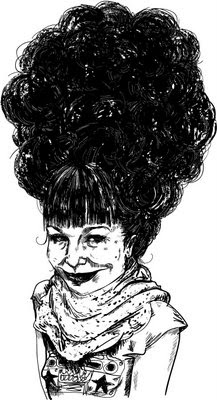
More illustration.  I know that the devil is in the details, and I should do more shading and whatnot, but I'm really into just cranking these out right now.  I spent about an hour on each one.

The above is another self-portrait, and the one beneath is based on a photo by the very talented Michael Kuby (who I'm lucky enough to be related to).  

August 13, 2008

Dear graphics tablet, I will marry you

I got a new thingamajig this weekend, and I have to tell you: never did I think I would love a piece of technology so much.  My Wacom graphics tablet* is...well, like I said - I basically got down on one knee and proposed.

These were done super fast due to a combination of very limited free time and total lack of patience.  I like Beth Ditto (who rules my world) the best, though I should have gone in for some more shading.

The self-portrait (with a toothbrush sticking out of my mouth) was done from a very dark picture, and I'm not a fan of how it turned out.  I was going for some lazy-ass cross-hatching, and the results were lazy-ass messy.  Some sort of balance between the two and more precise line-work is needed.  But all in all, not bad for a start.

*I could pretend I did these the old fashioned way with ink and paper, but I'm all for honesty in art.  And, as a certain friend of mine once said, "Work smarter, not harder, stupid."

The mural is up!

This weekend I helped local artist Ian Mulder install a mural of Lois Hole on 113 ave and 95 st in Edmonton (I helped to paint it too, but that was done in-studio).  It was crazy hot and we were on a south facing wall, but totally worth all the blood, sweat, and tears (okay, just sweat - but lots of it!) to see a truly ugly building turned into something the whole community can be proud of (and it was really nice how many people stopped to thank us while we were putting it up).

The before:

And after!!!

August 8, 2008

Scant Update

I haven't posted much in the last while, having moved across the country and working two jobs and reuniting with old friends and all, BUT, some exciting news:

One of my jobs is as a mural painters assistant, and we're installing our first mural (it was done in-studio, on panels) tomorrow!  It's going to be long, exciting, and quite possibly intermittently frustrating day, but I'm looking forward to seeing the behemoth thing up on a wall, all in one piece.  I think that it measures 26 feet by 15 feet or so, but honestly, I'm not sure.

Many photos when this is all done!

xo
kirsten

July 14, 2008

Free Patterns Online

For those of you who are visually attuned, you'll notice a change or two here (I'm secretly beaming at having been able to figure out enough HTML to make this thing look prettier - maybe building my own website this year won't be such a chore...oh dear, that had the ring of 'famous last words', didn't it?).
The background pattern I used is from Squidfingers, and since he is kind enough to offer 158 patterns for free, asking only for a shout-out in return, here it is.  They're mostly really great, and I'm sure I'll make use of some more in the future.
While we're talking patterns, the aforementioned Vikki (see below) linked to a great site today on her blog GoMediaZine.  This page is a tutorial on building intricate patterns in Illustrator (not that you'll need to do that with the Squidfingers link).

*Edit: oh my god, I'm in love.  If you're into patterns, or colour relationships, THIS will knock your socks off!   

Scratch Animation stole my heart!

This weekend I went to the FAVA cinemathon (gorgeous poster here courtesy of superstar graphic designer Vikki), and damn if I didn't completely fall in love with scratch animation.
[cinemathonweb.jpg]
Tables were set up around the concession area where you could draw on or scratch into 35mm film.  The film scraps were then looped together, and projected onto the screen behind the bands.

The only band I saw was Electricity for Everybody!, and they were great.  Multiple projections of colours and carefully planned lines swirled behind them, creating a truly amazing atmosphere.  I'm completely obsessed with this needing to be done at way more shows, because it really elevated the live music experience.

From Harrison Stark comes this nice piece that pretty well illustrates what was going on. Except - think multiple overlapping projections.


For more information on scratch animation and drawing on film stock, the NFB has a nice article, and for those lucky enough to be in New York, the Drawing Centre has an exhibition on it right now.  There are some beautiful images from it here.

June 23, 2008

Everybody I Know Loves Degrassi

If you're Canadian, you know exactly what I'm talking about. If not, I'm terribly sorry that you had to spend your teenage years without the comfort of a great public television show featuring others as zitty and angsty as yourself.

It may not sound like a winner, but it was great. Latecomers who try to get into Degrassi in their post-highschool years often don't - can't - understand the appeal. Part of the power of the show was undoubtedly the empathy it inspired in its teenaged viewers. While the premise of most television shows is based on a sort of voyeuristic longing, Degrassi was less about peering into the lives of the upper class, and more about peering into your own house. For those of us who tuned in to the CBC weekdays at 4, this series is for you.

The series is a mix of ink, graphite, acrylic gel, pastel, oil, acrylic, and collage. I was going for something that would look illustration-like and flat from a distance, but would reveal a greater complexity close up.

Snake.
Arthur.
Spike.
Lucy.


Joey Jeremiah!
And my personal favourite (as a character) - Caitlin.

View of the series as installed at the Concordia University Painting and Drawing Students Association show on Crescent Street in Montreal, 2007.